These days, use of the Web in our daily life is increasing rapidly. People use websites and apps to accomplish their daily life activities, such as shopping, booking movie and travel tickets, connecting with friends, banking, and much more. To accomplish all these tasks, people use variety of websites and apps. These websites and apps are accessed from a wide range of devices including, desktop, laptops, tablets, and mobile devices. Thus, such websites should be accurately rendered on the non-portable devices, such as desktops and laptops, as well as on the portable or mobile devices, such as handheld phones and tablets.
However, in traditional website design approach, Web pages for different size of devices are designed separately. It requires lots of extra money and resources. In addition, designers also need to manage different versions of a Web page for different devices because every device differs in terms of the operating system, screen size, configuration, and features.
To overcome these limitations, Technologies Era follow a new approach known as the Responsive Website Designing (RWD) technique. Responsive Website Design is an effective Web design technique that allows designers to create device-independent Web pages that can be easily rendered on the different screen size of devices. Web pages created by using the Responsive Website Designing approach are not dependent on the device specific properties, attributes, browsers, and operating systems.
The Responsive Web Designing Technique combines the:
- HTML: for representing UI elements
- CSS: for styling the UI element
- JavaScript or jQuery: for adding interactivity to Web pages
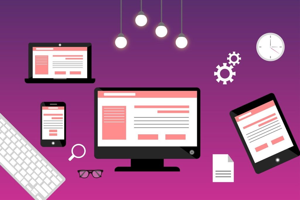
Using Responsive Website Designing technique at Technologies Era, we can create a single website that can be viewed and responded on multiple devices having different size of screens. The every Web page within the website implicitly adjusts its design to match the device screen’s height and width on which it is accessed. Therefore, Responsive Website Design offers the most optimized user experience for desktops, laptops, tablets, and mobile devices.
Some of the common advantages of the Responsive Website Designing technique are:
- Requires less maintenance
- Provides good viewing experience
- Renders on new devices easily
- Saves time and cost of designing a website
- Saves time and cost of website maintenance
- Improves ranking of a website in search engine result pages
If you want an attractive and responsive website that can be viewed on a wide range of devices without any trouble, SourceTech Software can offer you the one-stop solution. We have industry experts who can give an astonishing look and feel to your website with responsive design.